Website colors can be very important to a company. When designing a logo or building a website colors are important.
People respond to any type of advertising based on emotions. The emotional component is what facilitates this process. Colors are Emotional!
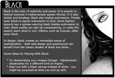
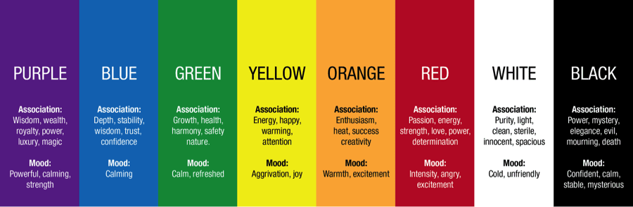
Black is the color of authority and power. It is also stylish and timeless. Black can also implies submission.
In design, black creates an immediate sense of sophistication – both web design and graphics art can benefit from the classic shades of black and white.
Some ideas for playing with black:
- Try desaturating your images for a different kind of impact.
- Start out with a black canvas instead of white – you might be surprised at what you end up with.
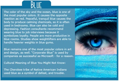
Blue is one of the most popular colors. Blue tends to be peaceful, tranquil and causes the body to produce calming chemicals. In some cases blue can also be cold and depressing. It can symbolize loyalty Blue has more complex and contradictory meanings than any other color. Blue is the most commonly used color in web design.
Design Hints for playing with blue:
- Blue can be over-used and may wind up a design cliché if used alone.
- Combining blue with another color creates a more creative effect.
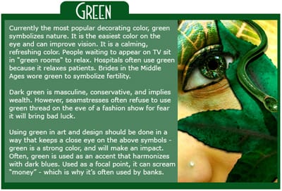
Green symbolizes nature. Green is relaxing and calming, it is also easy on the eyes. In the middle ages it symbolized fertility. Dark green is masculine, conservative and implies wealth. Green can be a strong color and will then make an impact. If used as a focal point it screams money. Green works great as an accent that harmonizes with dark blues.
Design Hints for playing with green:
- There are more shades of green than that of any other color. Use several shades together.
- For websites with too much blue change pieces and parts to aqua or turquoise are colors that are typically half green and half blue.
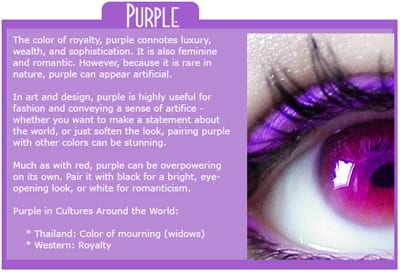
Purple is the color of royalty connotes luxury, wealth and sophistication. Purple can be feminine and romantic. As it is rare in nature is can also appear artificial or supernatural. Pairing purple with other colors can be stunning. There are three distinct purples: Red-Purple which are warm, Purple which is neutral, Blue-Purple which is cool.
Design Hints for playing with purple:
- Try using the distinct colors to lead people from a cool to warm mood.
- Purple is the hardest color for the eye to discriminate so try making it flow with hints of purple.
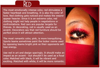
Red is the most emotionally intense color. Red can stimulate a faster heartbeat or breathing. Of course it symbolizes love. Red is normally uses in accents and when you want to draw attention. Red in the range of pinks is more tranquilizing and is the most romantic. There are 2 kinds of red Yellow-based reds are called tomato reds which men seem to prefer. Blue-based reds are called berry reds which appeal to women more.
Design Hints for playing with red:
- Use red sparingly in designs, place it where you want to make a bold statement or impact.
- Match red with black to be more vibrant and exciting.
- Match red with white to be more romantic.
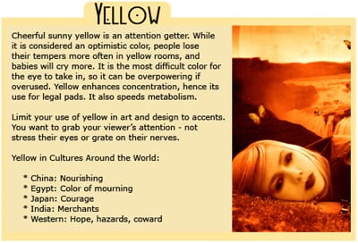
Yellow is the most luminous of all the colors of the spectrum. Yellow is cheerful and an attention getter. Yellow can be overpowering if over used, but it can enhance concentration and speed metabolism. Yellow is best as a highlight to grab the viewer’s attention. When used too much it can make tempers flair. Mix a little black into yellow and it becomes a sickly yellow-green.
Design Hints for playing with yellow:
- In text try highlighting the most important sentence in yellow when using a large document.
- use a yellow star next to something important like a special sale..
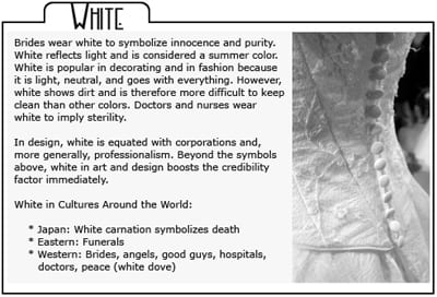
White symbolizes innocence, purity, minimalist, clean and sterile. White reflects light and is considered a summer color. White is light, neutral and goes with everything. White equates with corporations and professionalism. White boosts the credibility factor immediately.
Design Hints for playing with white:
- Try creating White areas in you layout on purpose.
- Try desaturating light pictures to create a cleaner looking picture that is stunning.
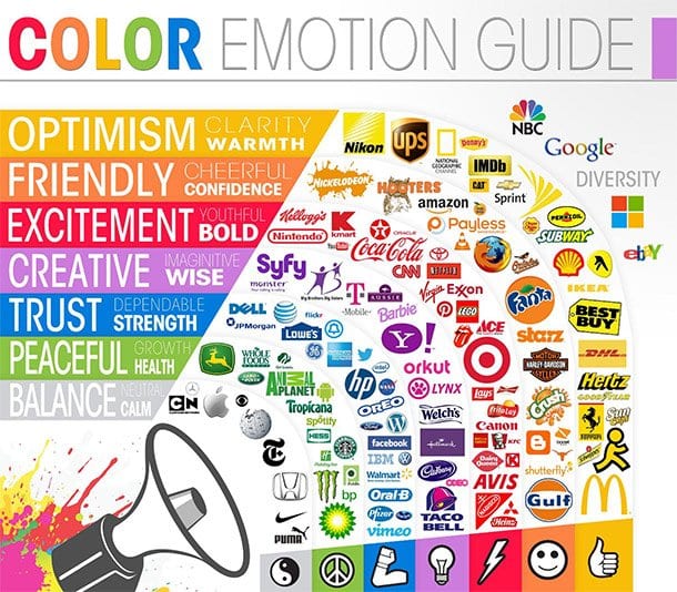
Here is a visual on colors and how businesses are using them to create emotions in their users.